The Ultimate Guide to Creating the Perfect Landing Page
A well-crafted landing page can make or break your digital marketing success. This guide breaks down the key elements of a high-converting landing page—from clear headlines and compelling calls-to-action to streamlined design—so you can capture more leads and drive real results.
Written by Keiran Griffiths
Last updated March 28, 2025 • First published October 1, 2024

SEO is a necessity in today’s digital landscape, but having the perfect landing page structure can play a huge role in converting visitors into customers. Whether your goal is to collect leads, sell a product, or promote a service, a well-designed landing page structure can be a powerful tool to drive conversions.
In this guide, we’ll break down the key elements of a high-converting landing page, along with a few actionable tips that you can use to help you create the perfect landing page structure that works.
Tips on How to Create the Perfect Landing Page Structure
- Set a Clear Goal. Focus your landing page on a single, specific action, such as capturing leads or making sales.
- Grab Attention with Headlines. Use clear, benefit-driven headlines to engage visitors right away.
- Utilize Strong Visuals. High-quality images and visuals boost engagement and keep visitors interested.
- Mobile Optimization is Key. Ensure your landing page structure is mobile-friendly to avoid losing potential customers.
- Simplify Forms. Keep forms short and use real-time validation to make it easy for users to fill them out.
- Build Trust with Social Proof. Include testimonials and reviews to reassure visitors about your brand.
- Test and Improve. Regularly A/B test your headlines, CTAs, and forms to optimize performance and increase conversions.
What is a Landing Page & Why Does It Matter?
A landing page is a focused, standalone web page designed for a specific marketing campaign or goal. It isn’t like your homepage, which might have multiple CTAs and varied messaging. Your landing page needs to be laser-focused on driving a single action such as signing up for a newsletter or purchasing a product.
The perfect landing page structure should be a crucial component of any digital marketing strategy. It is designed specifically to convert visitors into leads or customers by focusing on one clear goal. Landing pages streamline the user experience by eliminating distractions and guiding users toward a single action.
This focused approach boosts conversion rates, improves lead generation through clear calls-to-action (CTAs), and enables precise performance tracking. Additionally, landing pages can be tailored to specific marketing campaigns, enhancing user experience and increasing ROI through targeted messaging and A/B testing for optimization.

What the Statistics Are Telling Us
According to a report by HubSpot, companies with 30 or more landing pages generate 7 times more leads than companies with fewer than 10 landing pages. The study also found that businesses with 40 or more landing pages get 12 times more leads than those with fewer than 5.
LIKE WHAT YOU’RE READING?
If these articles are helpful,
imagine what our team
can do for you!


Not Sure What Your Website Needs Anymore?
Search has changed. AI tools are influencing visibility. Let’s clarify what actually matters for your business now.
Not Sure What Your Website Needs Anymore?

Search has changed. AI tools are influencing visibility. Let’s clarify what actually matters for your business now.
You can see how the perfect landing page structure can be crucial to your marketing success. Unfortunately, landing pages are so underused. According to MarketingSherpa, “The number one reason businesses don’t use landing pages is because their marketing department doesn’t know how to set them up or they are too overloaded.” If this is you, continue reading and find out how to create the perfect landing page structure including:
- Attention Grabbing Headlines
- Strong Visuals
- Powerful Calls-to-Action (CTA)
- Persuasive Copy that Converts
- Strong Social Proof & Testimonials
- Mobile Friendliness
- User Friendly Navigation
- Concise Optimized Forms
- Making Improvements through A/B Testing
How to Craft a Winning Headline That Grabs Attention
The headline is the first thing visitors see when they land on your page, and it plays an important role in determining whether your visitors stay or leave. A well-crafted headline grabs attention and encourages users to take action.
Why Your Headline Matters
Headlines act as the gateway to your content. According to research by Copyblogger, 8 out of 10 people will read your headline, but only 2 out of 10 will continue reading the rest of your page. This makes the headline the key to capturing initial interest. A clear, specific, and benefit-driven headline can significantly improve engagement and conversions.
Pro Tips for Headline Success:
1. Be Clear and Specific
Clarity is important when creating a headline. Visitors should immediately understand the main point of your page and what value they can expect. Vague or confusing headlines will cause potential leads to bounce away quickly.
Example:
- Instead of “Learn About SEO,” use “Boost Your SEO Rankings in 30 Days.”
Why it works: The second headline outlines what visitors can achieve from the page and the time frame, creating more immediate interest.
2. Use Power Words
Certain words have been proven to bring on emotional responses or actions from readers. Power words like “free,” “exclusive,” “proven,” or “guaranteed” improve engagement because they offer something desirable or suggest a high level of credibility.
Example:
- “Get Your Free Guide to Social Media Marketing”
- “Discover Exclusive Tips to Skyrocket Your Sales”
3. Add Numbers for Tangible Value
Headlines with numbers perform well because they show something concrete and set clear expectations. According to Conductor, headlines that include numbers are 36% more likely to generate clicks. Numbers like “10 Tips” or “Boost Your SEO by 200%” make the offer more tangible and easier for the reader to understand.
Example:
- “Boost Your SEO by 200% in Just 3 Steps”
Case Study: The Impact of a Strong Headline
Basecamp, a project management tool, saw a 40% increase in conversions after changing its homepage headline to be more specific and value-driven. The original headline, “Project Management Software,” was replaced with “Finally, A Simple Way to Manage Your Projects Without the Overhead,” which clearly communicated a solution to the main problem of their target audience.
Why Strong Visuals Matter More Than You Think
Visual content is a super powerful tool for engaging visitors and driving conversions on your landing page. Humans are naturally drawn to images, and visual content can share information faster than text. Studies by 3M Corporation show that visuals are processed 60,000 times faster than text, making them essential for quickly grabbing attention and keeping visitors engaged. In fact, optimized content with relevant images gets 94% more views than content without visuals, according to MDG Advertising.

Actionable Visual Tips:
- Use High-Quality Images: Low-quality or irrelevant images can decrease trust in your brand. Avoid generic stock photos and opt for custom photography or professional images that really reflect your brand.
- Show, Don’t Tell: If you’re selling a product, demonstrate its benefits visually. For example, Patagonia uses visuals of breathtaking natural landscapes and outdoor enthusiasts using their products. These images are often paired with videos showcasing the company’s commitment to environmental sustainability. This creates a strong emotional connection with the audience, aligning their purchase decisions with Patagonia’s mission to protect nature.
- Optimize for Speed: Google reports that 53% of mobile users abandon a site if it takes longer than 3 seconds to load. Optimizing your visuals by compressing images or using faster-loading formats like WebP can prevent slow load times that drive visitors away.
The Secret to Crafting a Powerful Call-to-Action (CTA)
The CTA is the conversion powerhouse of your landing page, guiding visitors to take the next step. A weak or vague CTA like “Click Here” does little to entice users, while a specific, benefit-driven CTA creates urgency and a clear path for the visitors to follow.
CTA Best Practices:
- Use Action-Oriented Language: Verbs like “Get,” “Start,” or “Claim” create a sense of urgency and clearly communicate the next step. For example, Evernote uses the CTA “Get Started for Free,” which is direct and emphasizes the ease of beginning the process.
- Make It Stand Out: Use contrasting colors for your CTA button to draw attention. Make sure the button contrasts with your page’s background to ensure it’s impossible to miss.
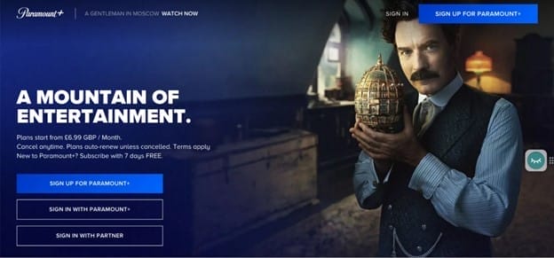
- Place It Strategically: Your CTA should be above the fold, but placing a secondary CTA further down the page can capture users who scroll. Don’t be afraid to place more then one CTA on your page, such as Paramount did.
Writing Copy That Persuades & Converts
Your landing page copy should be concise, engaging, and focused on solving the visitor’s problem. According to Nielsen Norman Group, users typically only read 20% of the text on a web page, so every word needs to work hard to persuade. The key is to focus on the benefits of your product or service, not just the features, and ensure that the copy speaks directly to the visitor’s needs.
Copywriting Tips for Maximum Impact:
- Focus on Benefits, Not Features: Instead of listing features, explain how those features benefit the user. For example, Slack doesn’t just say, “Our tool integrates with other apps.” Instead, they word it as, “Save time by integrating with tools you already use, so you can focus on what really matters.” This directly addresses the user’s pain point of wasting time on unnecessary tasks.
- Use Bullet Points for Clarity: Bullet points break up large blocks of text and make your content scannable, which is important for keeping visitors engaged.
- Speak Directly to Your Audience: Use second-person language (“you”) to create a connection with the reader. This personalizes the experience and makes the visitor feel like the content is speaking directly to them and their needs. For instance, Spotify uses the copy, “Get music you’ll love,” which feels more personal and engaging than a generic statement about their product.
Building Trust with Social Proof & Testimonials
Social proof is a powerful tool in influencing potential customers’ decisions. It gives reassurance by showing that others have had positive experiences with your brand, increasing credibility. Testimonials, case studies, and user reviews can be used as authentic endorsements, helping to build trust. When potential customers see social proof, they are more likely to feel confident in their decision to continue and engage with your brand.
How to Build Trust:
- Feature Real Testimonials: Include genuine reviews from real customers, complete with names and photos for authenticity.
- Use Numbers to Support Your Claims: For example, “98% of our customers saw results within two weeks.”
- Display Trust Badges: If you have certifications, industry awards, or security seals, make sure they’re prominently displayed.
Why Mobile Optimization is No Longer Optional
With the majority of web traffic coming from mobile devices, it’s crucial that your perfect landing page structure is fully responsive. If your page doesn’t work well on mobile, you’re losing many potential conversions.
Mobile Optimization Tips:
- Test on Multiple Devices: Make sure your landing page looks and functions properly across multiple screen sizes.
- Prioritize Page Speed: To make sure your site runs efficiently and quickly, several tools can help you check and optimize page load times. These include:
- Google PageSpeed Insights: This tool analyzes your webpage performance and provides suggestions to improve load times on both mobile and desktop.
- GTmetrix: A popular tool that offers detailed reports on website speed and identifies elements slowing down your site.
- Pingdom: Helps monitor your website’s speed and overall performance from different locations globally.
- Use Mobile-Friendly Forms: Simplify forms on mobile by reducing the number of fields and making sure buttons are large enough for easy tapping.
See our post on Mobile Local SEO.
Streamline the User Experience with Simple Navigation
All landing pages should have one clear goal, and anything that distracts from that goal should be removed. Employ Website Navigation Best Practices to create simple, easy-to-use navigation that makes sure visitors stay focused on the call-to-action (CTA).
Simplifying Navigation for Better Conversions:
- Limit External Links: Keep visitors on the page by avoiding unnecessary outbound links.
- Guide the Visitor’s Journey: Apple’s website is a great example of using visual hierarchy and spacing to guide the user’s attention. The clean design directs the eye to the most important elements, such as product images and clear Call to Action (CTA) buttons, ensuring a smooth user experience. You can explore this in action on Apple’s website.
- Avoid Overwhelming the Visitor: Dropbox’s homepage showcases an effective use of whitespace, keeping the page uncluttered and focusing attention on key information. The simple design makes it easy for visitors to navigate the page without feeling overwhelmed by content, allowing users to quickly find what they need. You can see this design in practice on Dropbox’s website. Another great example is Uber where they take the user to a very simple website with one specific goal.

Optimizing Your Forms for Higher Conversions
If you have a form on your landing page, it’s important to make it as easy and intuitive as possible. Long, complex forms can deter potential leads and significantly lower your conversion rates.
Form Optimization Tips:
- Keep It Short: Ask only for the most crucial information. Typically, a name and an email address are enough for a first interaction. Minimizing the number of fields reduces user friction and encourages higher submission rates.
- Use Inline Validation: Provide users with real-time feedback as they fill out the form. This prevents mistakes from being submitted and avoids the frustration of having to correct errors after submission.
- Offer Incentives: Encourage visitors to complete the form by offering something in return, such as a freebie, discount, or exclusive content. For example, “Sign up and get 10% off your first purchase” gives users a reason to submit their information.
A/B Testing: The Key to Continuous Improvement
Landing pages are never truly finished; it is simply a work in progress. The best way to improve your landing page over time is through A/B testing. By testing different elements, you can optimize for the highest possible conversion rate.
Additionally, if you’re struggling to optimize forms or analyze the performance of your landing page, consider using tools like our 1st on the List Analytics & Reporting Services. These tools give comprehensive insights into visitor behavior, helping you make data-driven decisions to improve user experience and really boost your conversion rates. For more information on how these tools can assist you, check out our SEO Analytics and Reporting services.
What to Test:
- Headlines: Test different headlines to see which one resonates most with your audience.
- CTA Button Color: A simple color change can have a big impact on conversions.
- Form Length: Experiment with fewer or more form fields to see which converts better.
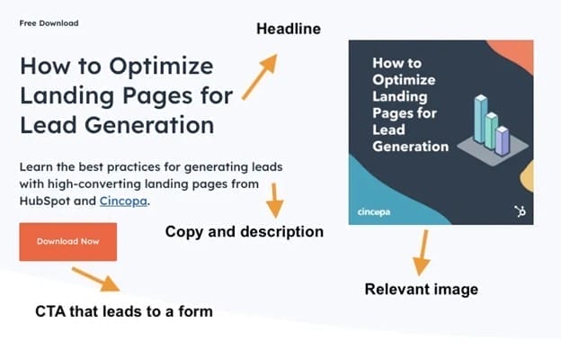
Conclusion – Build, Test, Improve & Succeed
The perfect landing page structure doesn’t happen by chance. It takes thoughtful planning, intentional design, and continuous optimization. It is a work in progress. By applying these strategies, you’ll be on track to create a landing page that not only grabs attention but effectively converts visitors into leads, subscribers, or customers.
Remember, your landing page is a dynamic part of your marketing strategy. Regularly test, analyze performance, and make improvements to ensure it continually delivers the best results for your business. Continuous optimization is the key to long-term landing page success.
FAQ – Perfect Landing Page Structure Takeaways
Contact Our SEO Experts
If you still have questions or need help creating the perfect landing page structure for your marketing efforts, please contact us.
You can also call us anytime toll-free at 1-888-262-6687 or send us an email.
1st on the List has been one of North America’s leading SEO companies since 1997!
Keiran Griffiths
Keiran Griffiths is the President & Managing Director at 1st on the List. He works exclusively out of the Abbotsford head office and has extensive experience helping small and big brands grow their business. His background is in restaurant and hospitality management as well as business development (he started his own property management company in 2014). Up for any challenge, Keiran works with clients to assess their budget and investment capabilities and come up with a marketing solution that will earn them the biggest bang for their buck.
Don’t miss out – get newest posts straight to your inbox!
OTHER ARTICLES WE THINK YOU’LL ENJOY
Partner With Us. Get More Leads.
Stop trying to do it all on your own – reach out to our team and we can discuss marketing strategies that are best suited for your business!
[NO HASSLE, NO PRESSURE, NO WORRIES – JUST MEANINGFUL INSIGHTS]


![A promotional graphic with the text "Is Your SEO Still Working in 2026?" and a blue button labeled "Book a Discovery Call." Below, it says "[No hassle, no pressure, just 30 minutes of insights]." The background has abstract blue shapes.](https://e28vvfjnij8.exactdn.com/wp-content/uploads/2024/09/blog-sidebar-cta-2-1.png?strip=all)
