How To Design a Website for SEO
How To Design a Small Business Website for SEO and Better User Experience Whether building a new site or wanting a website redesign, it’s important to know how to design a website for SEO. Having a website is key for any business in the online digital age, but building one isn’t simple – let alone…
Written by Robin Namur
Last updated February 27, 2025 • First published March 31, 2024
How To Design a Small Business Website for SEO and Better User Experience
Whether building a new site or wanting a website redesign, it’s important to know how to design a website for SEO.
Having a website is key for any business in the online digital age, but building one isn’t simple – let alone having a website that nobody sees…
A professionally designed website for your small business should provide the best experience for customers using it and search engines ranking it. Just like your offline business operations, your online business should showcase your brand in a way that makes you proud.
Here’s how to design a website for SEO and for improving the user experience. You’ll need to include:
- A clear, user-friendly navigation structure
- Visually appealing design
- SEO Best Practices – EEAT, optimized content
- SEO-friendly website structure
- Mobile first/mobile friendly design
- ADA Compliance – Accessibility for users with disabilities
- Link Building – Backlinks from other websites related to your industry
No need to get overwhelmed! In this post, we break down all the steps on how to design a website for SEO and improve the user experience. We’ll share our 7 tried and true tips for designing an SEO-friendly website that will attract visitors and leads, improve conversions, and increase your visibility in search results.
7 Tips for Designing a Great Website
1. User-Friendly Website Navigation
No one likes a hard-to-navigate website. Not users and certainly not search engines. Creating a clear and intuitive navigation structure is the foundation of good website design. It allows users to find what they’re looking for easily and incentivizes them to stay on your website longer.
LIKE WHAT YOU’RE READING?
If these articles are helpful,
imagine what our team
can do for you!


More Traffic. Leads. Business.
I want to show you how SEO can grow your business in ways you haven’t seen before.
More Traffic. Leads. Growth.

I want to show you how SEO can grow your business in ways you haven’t seen before.
Below are the building blocks of user-friendly website navigation:
Simple Menu
A well-laid-out menu is important so that web visitors can find what they are looking for regardless of which page they are on. A navigation menu is typically located at the top or side of a website and provides links to the main pages of the website. The menu should be simple, easy to understand, and consistent across all pages of your website.
Organized Pages
The pages on your website should be organized according to the user’s needs and goals. This means grouping similar pages, such as products, services, or blog posts, and providing clear labels that indicate what the user can expect to find on each page.
Search Bar

A search bar function is essential for a user-friendly navigation structure. It lets users quickly find specific information on your website without combing the entire navigation menu. The search bar should be obvious and live either in the header or the footer of every page. Use a search algorithm that returns relevant results and suggests results based on the user’s query.
As per Google’s Web Design Guidelines,
“Don’t make your user think any more than he has to. If a user can’t find out what he or she is looking for right away, there’s a high probability he or she will navigate away from your site and never return. Ask yourself: if I were a potential customer coming to this website, what would be the most important information to me?”
Clear CTA
Your CTA (call-to-action) should be clear throughout your website. Do you want visitors to call your business, fill out a form, or sign up for your newsletter? This CTA should be prominent, clear, and action-oriented, like a button that guides users to take the desired action.
AI-Driven Personalization
To improve user-friendly navigation even further, consider integrating AI-driven suggestions that personalize the user experience. This advanced feature can guide your visitors more intuitively, making sure they find what they need with ease. Remember, a simple menu and organized pages are still the foundation, but personalization is the future.
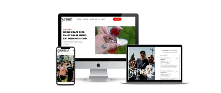
A visually appealing website our web designers built for a company in the craft beer industry
2. Visually Appealing Design
A good website is all about marrying form and function. It’s easy on the eyes and crucial for providing a good user experience. The visually appealing design keeps users on your website for longer and can lead to increased engagement and conversions.
This is the trifecta of visually appealing website design:
Consistent Look and Layout
So, how do you design a website’s layout? It’s disorienting if every page on your website looks completely different. Strive for consistency instead which means a similar page layout with a clear and intuitive structure. This can be done using a grid system that divides your website into rows and columns. Colours, typography, and images should stay consistent throughout your website for a cohesive look and feel.
Easy-to-Read Fonts
Fonts may not sound exciting, but it’s important to be deliberate with your typography selection and use it consistently. Your website should use a font that is clear, easy to read, and consistently sized throughout the website. A clear hierarchy of headings and subheadings will make your content more readable and easier to scan for website visitors.
Non-Blurry and Relevant Images & Videos
Videos and images are great for adding visual interest to your website and conveying messages more effectively. High-quality images and videos can also elevate your website’s credibility and professionalism. However, it is important only to use images and videos that are relevant web optimized so that they load quickly and don’t slow loading times.
“It gets asked, “Why do I need specific or any written content on my website?” Building a website that’s not just visually appealing but also optimized for search gets your site found by your target audience. A beautiful website might catch the eye, but without SEO, or a title above the fold, it might never be seen by potential customers. SEO can drive more traffic and ultimately, more conversions.”
Keiran Griffiths, President & Managing Director, 1st on the List
3. Build for Search Engine Optimization
It doesn’t matter if you have an amazingly beautiful website if no one can find it. Consider these SEO best practices when designing your website so that it’s easy to index and show up on Google:

An example of long-tail keyword ‘seo company abbotsford’ showing in SERPs.
Long-Tail Keywords
One of the first steps in optimizing a website for users and search engines is to use relevant and high-quality keywords. This includes your website’s content, meta tags, and structured data. Small businesses should aim to use long-tail keywords which are more specific and less competitive. This can help attract more relevant traffic with a better chance of converting.

An example of a webpage’s metadata from searching in Google ‘1st on the list’.
Metadata
Using metadata is another important part of optimizing your website. This includes including meta tags in the website’s code, such as the title tag and the meta description, which provide information about the website’s content to search engines. The title tag should be clear and concise and include the primary keyword for the page. The meta description should also provide a summary of the page’s content.
Structured data
Structured data, or schema markup, is code added to the website’s HTML to provide additional information to search engines about the website’s content. This can include business hours, locations, and contact information. Small businesses can also use structured data to mark up their website’s content, such as products, reviews, and events, to boost visibility in search results.
Quality Content
You can’t hack your way to SEO success. You should also aim to provide well-written informative content relevant to your audience, business, and industry. This means creating quality content such as blog posts, product descriptions, and instructional videos that provide value to users. This should also be unique Try also including a section on your website for customer reviews and ratings to help users make informed purchasing decisions.
E-E-A-T
Google’s E-E-A-T guidelines for SEO are about building trust with your website visitors and Google. Here’s how it can help your web design:
- Experience: Design your site so it’s easy and enjoyable to use. Happy visitors stay longer.
- Expertise: Show what you know. Share helpful tips and information that prove you’re an expert in your field.
- Authoritativeness: Earn trust by being a go-to source. Get recognized by other experts and sites in your industry.
- Trustworthiness: Keep your site secure and your information accurate. This makes users and Google see you as reliable.
When your website ticks these boxes, it’s more likely to rank higher on search engines and satisfy visitors.
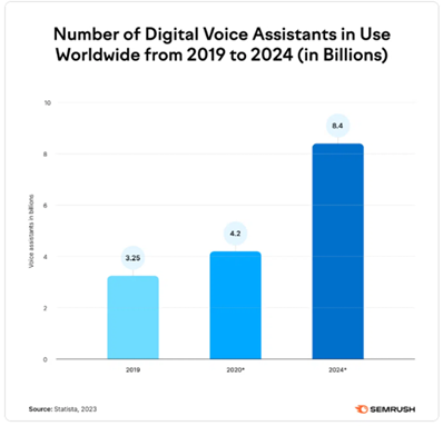
Write for Voice Search
As you can see from the Semrush graph above, voice search through voice assistants is continuously growing, so make sure your website talks the talk. Incorporate SEO strategies for digital voice search to cater to users who prefer speaking over typing. It’s efficient and broadens your site’s accessibility.
Social Proof with Customer Reviews
To put it simply, what others say about your business online carries weight offline. Imagine visiting a website and being greeted with real feedback from customers. Customer testimonials are experiences shared by your customers that highlight the value of your services or products. Search engines also recognize this as an authoritative sign.
Here’s how to harness reviews:
- Showcase a mix of reviews on your homepage.
- Use real reviews, names, and photos.
- Include a mix of ratings to show fairness and credibility.
- Have a dedicated testimonial page.

A Venn diagram from ahrefs illustrating the key components of an SEO-friendly website.
4. SEO-Friendly Structure
It’s important to structure your website correctly so that search engines (and users) can easily understand your content. Proper website structure leads to a better user experience, faster indexing, and increased visibility in search results.
Here’s everything you need to do for a well-structured, SEO-friendly website:
Heading Structure
Proper heading structure makes it easier to read through large chunks of text. It also makes it easier for search engines to understand what’s important. This means using headings such as H1, H2, and H3 to organize your content. Make sure you use a clear and consistent hierarchy of headings and subheadings so that search engines (and readers) can easily differentiate between main topics and subtopics.
Alt Tags
If you have images on your website (and if you’ve been paying attention, you know you should), you must include alt tags. Alt tags are used to describe images for search engines. This can include the image’s subject, the size of the image, and the file name. Not only does this help with SEO, but by including alt tags, small businesses can also improve the accessibility of their website for users with disabilities.

An example of an XML sitemap, also known as a sitemap.xml file
XML Sitemap
Why not give search engines a little helping hand? An XML sitemap is a file with a list of all the pages on the website and is used to help search engines understand the website’s structure. By creating an XML sitemap and submitting it to search engines, you can speed up the indexing of your website and make it easier for users to find your website in the SERPs.
As per Statistica:
By 2025, it’s expected that there will be 7.5 billion mobile users worldwide, showing just how essential it is for websites to focus on mobile-first design to connect with the vast majority of internet users.
5. Mobile-First Website Design
There’s no excuse not to optimize your website for mobile devices. It’s now recommended that every website have a mobile-first website design. Most people browse the internet on their phones, so your website must look and perform amazingly on mobile.
Here are a few things to keep in mind when designing for mobile first:
Responsive Design
Your website should look great no matter what browser or device a visitor uses and adapt to different screen sizes. Make sure to test your website and ensure that it provides a good user experience for all users.
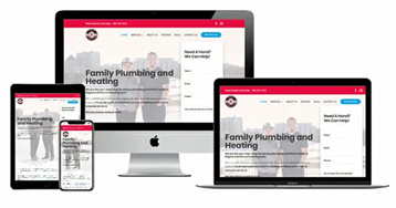
See firsthand the mobile-responsive design we crafted for a plumbing and heating company by visiting their website on your phone. Notice how seamlessly it operates across devices.
Fast Load Times
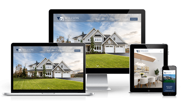
People are on the go, and they have a need for speed. Nobody is going to stick around and wait for a slow-loading website. Not only does this kill user experience, but you’ll also be penalized in search engine rankings. To optimize the loading speed, small businesses should use a content delivery network (CDN) which can help by caching static content, such as images and videos, on servers in different geographic locations. Don’t forget to also compress images and videos and minimize the use of large files and scripts. Keep testing until your website loads in 2 seconds or less! Visit our portfolio page for Willson Design Abbotsford for an example of high-res fast loading images.

Speaking of a need for speed – 1st on the list now offers website hosting services for businesses.
Thumb Friendly
You don’t use a mouse when browsing on your phone, do you? A key component of designing for mobile first is considering touch-friendly buttons and elements. Your website should be easy to browse by thumb, so ensure buttons are large and elements are spaced out. This is especially important for your menu, search bar, and CTAs.
Monitor how visitors browse your website with tools such as Google Analytics and A/B testing to track behaviour and understand how to improve the website’s navigation structure.
App-Like Experience
With mobile-first indexing in full effect, prioritize creating an app-like experience on mobile devices. This approach caters to the growing number of users who expect seamless navigation and interaction, mirroring the functionality they get from their phone apps.

6. Accessibility – ADA Compliance
It’s important to consider all users when designing a small business website. Making your website accessible for those with disabilities isn’t complicated, but it does require additional thought and consideration.
Incorporate the following into your ADA-compliant website design:
Alt Text
We’ve already touched on the importance of Alt text, but it is an absolute must for making your website ADA-compliant. Providing alternative text for images and other media creates content descriptions that screen readers can read. This allows visually impaired users to understand your media’s content, even if they can’t see it.
Your Alt text should describe the media without adding any irrelevant information. Test it out by reading the text aloud, as this is how it will sound when read by a screen reader. Keep Alt text brief and to the point.
Consider Screen Readers
Speaking of screen readers, it’s important to consider your website as a whole. Screen readers are software that read the text on a website out loud for visually impaired users.
To make your website screen reader-friendly, you should use clear, descriptive headings and labels for all links, buttons, and other interactive elements. Additionally, ensure that your website is properly structured using HTML tags for any headings, lists, and tables to help screen readers understand the organization of the content.
Keyboard-Only Navigation
Keyboard-only navigation is designed for users who cannot use a mouse to navigate a website. To provide keyboard-only navigation, all interactive elements, such as links and buttons, should be accessible using the tab key. Make sure to also provide shortcut keys for navigating your website.
High Contrast Ratio
A high contrast ratio is important for users who have difficulty reading small text or those with poor vision. In some ways, this is an extension of the importance of clear and easy-to-read typography. In addition to providing high contrast between your chosen font and background, provide options for users to resize text and increase the contrast ratio of the website according to their needs.

An example of a website linking to another company website (a backlink!)
7. Backlinks
Building links back to your website from relevant and authoritative websites is an essential part of SEO and can make a world of difference in your business’s visibility in the SERPs. Backlinks are links from other websites that navigate to a specific page on your website. These links boost your website’s authority and can hugely impact your visibility.
Here’s how to go about getting backlinks for your website:
Aim to Post Quality Content
The first step in amassing backlinks is to create website content that is informative, relevant, and valuable to your target audience. This content should be well-researched, well-written, and relevant to your business or industry. It should not be blurry, out-of-focus, have spelling mistakes, etc. Focus on making it shareable and easy to link so that other websites may reference it in their content.
Network on Social Media
Social media is a great tool for building community and engaging with customers and other businesses. Networking on these apps can also be an effective way of attracting backlinks. By actively engaging with other websites and businesses on social media, you can build relationships and increase the likelihood of them linking to your content. Modern strategies such as influencer partnerships or those big online in your local community could be a way as well. Check out LinkedIn, Facebook groups, and Instagram to find and connect with potential linkers.
Create Infographics & Videos
People share what they find engaging and informative. Another way to attract backlinks is by creating infographics, videos, and other types of multimedia that are shareable and easy to link to. These types of content are often more engaging than plain text and are more easily shared across platforms.
Keep Track of Your Links
Your hard work shouldn’t go unrecognized! It’s important to keep track of your backlinks and monitor them regularly. This allows you to identify and remove any broken links or links pointing to low-quality content. It also allows you to pinpoint weaknesses and seek new links from authoritative and relevant websites. Remember that building backlinks is a long-term strategy and requires consistent effort to see the results.
Psst… We have a full guide on how to efficiently build white-hat (ethical) links for your website. Read it HERE.
Summary
Designing a beautiful and user-friendly website requires a combination of technical know-how and SEO best practices. You want your business to put its best foot forward, and that means a professional website that looks great and provides the best possible experience for both users and search engines.
To summarize, an optimized website requires an intuitive navigation structure, visually appealing design, optimized content, proper website structure, mobile-first design, ADA compliance, and building backlinks from other websites. If you do it all right, you can expect increased visibility, visitors, and conversions.
If all that sounds like too much to tackle, don’t worry. We know someone that can help…
Does Your Website Need a Little TLC?
We get it—designing an SEO-friendly website can be complex, and you’ve got enough on your plate. That’s where we come in.
First, we’ll get to know you and your business. We’ll set clear goals for your website and start with a solid understanding of where you’re at now. Then, everything from content to the technical setup is mapped out.
From here, it’s built with WordPress and brought to life. To see the websites we’ve currently launched, check out our website design portfolio!
Let’s get your website working harder for your business. Our web design team at 1st on the List is here to help. Contact or call us at 1-888-262-6687 to set up a consultation.
FAQs on How to Design a Website for a Business
How long does it take to design a website?
Designing a website can take anywhere from a few weeks to several months, depending on the project’s complexity. If you’re looking for an experienced team to guide you through this process, 1st on the List is ready to help.
How to choose a website design company?
Look for relevant experience, a portfolio of work, client testimonials, and a process that aligns with your goals. It’s essential to choose a company that understands your industry and can offer personalized strategies. For inspiration, check out the success stories from our SEO work with clients.
How to analyze a website design?
Analyzing a website design involves evaluating its user experience, responsiveness, speed, SEO, and visual appeal. Tools like Google Analytics can provide insights into some user behaviour, while professional SEO audits can easily reveal optimization opportunities for your business.
Do businesses really need a website?
Absolutely. A website is crucial for credibility, visibility, and reaching a wider audience. It’s your online storefront, open 24/7, allowing customers to find you anytime. If you’re looking to build or refresh your online presence, our amazing web designers can create a website that not only looks great but also drives results.
How often should I update my website’s design?
Generally, a website should be updated or refreshed every 2-3 years to keep up with design trends, technological advancements, and user expectations. Regular updates help improve user experience and SEO. If your website is due for an update, 1st on the List can help revitalize your site to keep it current and engaging. Let’s chat! 1-888-262-6687
Robin Namur
Robin Namur is a Senior Website Designer at 1st on the List with a strong background in development and website security. Her ability to capture our client’s style and vision while incorporating SEO and User Experience best practices puts her in high demand. Robin specializes in WordPress and website speed optimization. When not behind her desk Robin is out exploring her local Maple Ridge neighborhood with her dog Gunner.
Don’t miss out – get newest posts straight to your inbox!
OTHER ARTICLES WE THINK YOU’LL ENJOY
Partner With Us. Get More Leads.
Stop trying to do it all on your own – reach out to our team and we can discuss marketing strategies that are best suited for your business!
[NO HASSLE, NO PRESSURE, NO WORRIES – JUST MEANINGFUL INSIGHTS]


