4 Ways to Measure Mobile Site Design and Usability
Have you noticed your mobile website traffic increase in the last year? Mobile website usage statistics suggest that by 2014 mobile internet users will overtake desktop internet users. If you haven’t already it’s time to start considering your mobile website.
Here are four ways to check your mobile website usability and monitor how well your mobile site design attracts mobile visitors.
1. Visit the site from a mobile device.
Pick up your iPhone or Android and actually visit your website. Test the mobile website’s navigation with your fingers. From the homepage can you easily find the contact page, store hours and add an item to the shopping cart? After moving between pages for thirty seconds or evaluate how easy or frustrating it is to navigate your website.
Some other questions to ask as you visit your website from a mobile device:
- Does the website adjust itself to fit in the screen properly or can you only see the top left corner of your website? Having the mobile website as not full width but autosized to the device’s screen resolution can make it easier to find important components of the website.
- Do you need to do a lot of pinching and scrolling to get to where you need to be?
- Does the site load fast enough?
- Does the mobile website layout allow you to get a phone number and directions almost instantaneously?
Another quick option is to use a mobile website preview tool such as ipadpeek to see what you website looks like on any device. The iphone4simulator mobile website simulator also works well.
2. Look at your mobile traffic as a percentage of your total traffic.
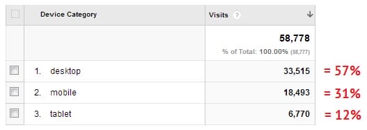
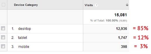
In the last several months we have found that most of our clients get between 25 and 30% mobile visitors and between 70 and 75% desktop traffic. To find this figure log into Analytics and go to Audience/ Mobile/ Overview. You will need to grab a calculator to determine percentages; simply divide the device visits by total visits.

This website is getting an expected level of mobile traffic.

This website gets an average amount of mobile traffic.

This website should be concerned about the very low levels of mobile traffic.
& ;
If you are getting a lower percentage of mobile traffic you need to ask yourself a few questions:
- Is this typical for my industry?
- What is keeping more mobile visitors from visiting my website?
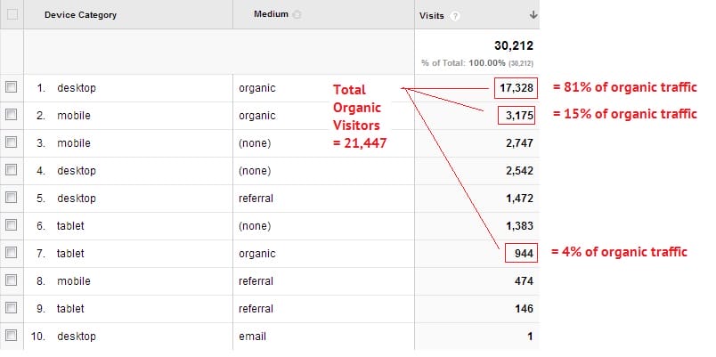
- Is there a big difference between mobile traffic from organic search and all visitor types? Within the Mobile Overview in Analytics, add the Secondary Dimension “Medium”. This will break down traffic by device and traffic source.

Mobile visitors account for 15% of all organic search traffic.
If you are questioning why your mobile search traffic is low then you should be aware that Google has confirmed that they favor websites that are mobile friendly for searches performed on a mobile device. This means if your website isn’t friendly to mobile visitors Google is less likely to show in results for mobile searches. Read more on Google’s Webmaster Central Blog here.
Search Engine Watch confirms that a “failure to fix annoying mobile experiences will now actively hinder your efforts to rank well within search results” (Source).
3. Check time on site and bounce rates for Desktop vs. Mobile traffic.
The best mobile marketing strategies focus on providing the best user experience.
Two basic metrics to measure user experience is time on site and bounce rate. We know that mobile visitors are often in a hurry to look for a quick answer such as an address, store hours or phone number. If these pieces of information are not accessible right away or if your mobile website looks too hard to navigate visitors will likely click “back” right away resulting in a high bounce rate and a very low time on site.
If your bounce rate for mobile visitors is more than double what it is for desktop visitors you should be concerned.
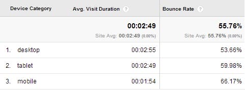
In the below example we see that mobile visitors spend 1:54 on the website and that desktop and tablet visitors spend about 2:50 on the site. The bounce rate is about 7-13% higher for mobile site visitors.

Mobile visitors have slightly lower engagement metrics but are still performing well.
Remember that your tablet traffic’s behavior will fall somewhere between desktop and mobile visitors. Many people use their tablet as a desktop when at home but it is still “finger operated” meaning navigation needs to be cleaner and easier to use.
4. Look at mobile visitors in terms of your website goals.
Are your mobile visitors doing what you want them to do on your website? If you have goals set up in Google Analytics such as completing a contact form or visiting a specific page you can see if there is a difference in behavior between mobile and desktop traffic. In Google Analytics go to Audience/ Mobile/ Overview and then click on the Goal Set at the top of the screen that you want to analyze.
Successful mobile campaigns may need “mobile specific” goals. You may not expect high conversion rates for downloading PDFs or completing a contact form but you can probably expect high conversion rates for viewing videos, looking at the map or a “click to call” phone number.
In the below example we can see that this site has a Quote Form goal and a Location Search goal. Desktop visitors are almost 3 times as likely to complete the quote form whereas mobile searchers are 1.3 times as likely to look up a location.

Desktop visitors complete more quote requests and mobile visitors do more searches for nearby stores.
I recently filled out a contact form on a website that first asked for my postal code. Based on the postal code it autofilled the street name, city and province. All I had to do was add my house number and the form was complete. You can imagine how much easier this was than trying to enter all my information on my phone’s keypad.
It is small user experience considerations like these that will help your mobile visitors achieve just as good goal conversions as your desktop visitors.
After clicking through your website on your phone and tablet and digging through your mobile website stats in Google Analytics how do your mobile marketing campaigns fare?
If the answer is “not so well” we can give you advice on how to create a mobile version of your website and how to provide a good website user experience regardless of the device your customer is using. Learn more here.
If we’ve caught your interest in mobile user experience you can continue to read all of our mobile articles.
